


Starbucks Mobile App Redesign
PROJECT BRIEF
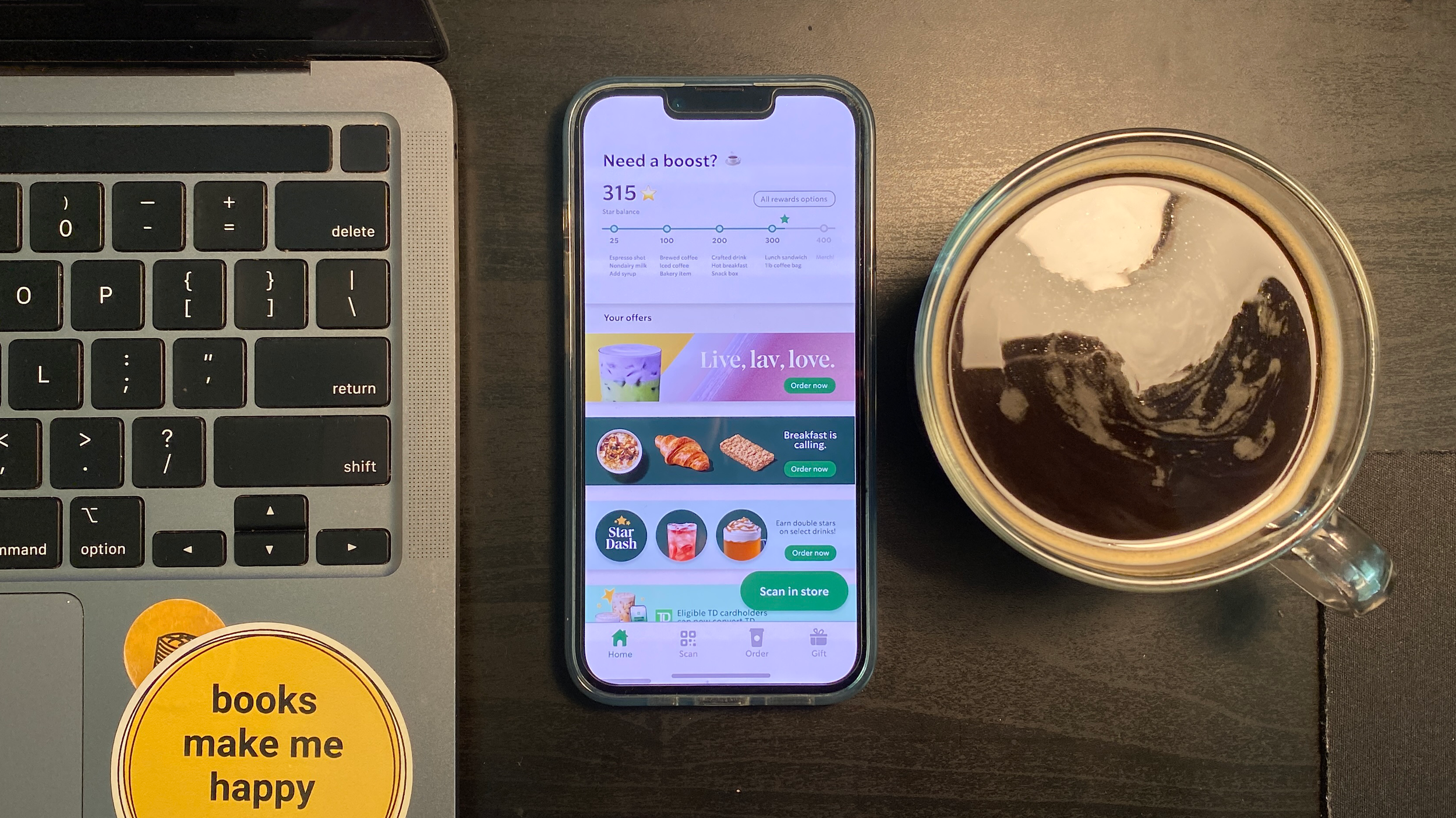
Having worked at Starbucks for nearly 7 years, I’ve helped troubleshoot the app more than once. Through the years, it’s been clear that the real issues aren’t bugs and glitches - they’re gaps in user consideration. This project was a great crossover of my education, and the job that helped pay for it.
Through my research, I identified four major aspects to focus on:
(1) A stronger emphasis on using the Star Rewards program,
(2) a reduction of redundancies,
(3) better-optimized space for user offers, and
(4) an integration of store-specific promotions to reduce waste.
STYLE GUIDE
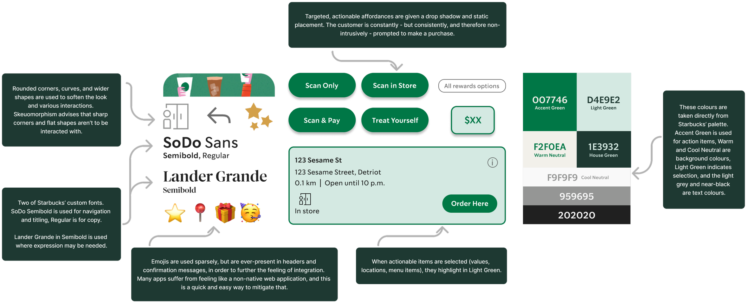
I created a style guide for this redesign based on Starbucks’ branding guidelines and the current graphic elements found within the app. The company applies a ratio of Expression : Function through their services and so the creative aspect is toned down for the app.
The app being too precise and ‘toned down’ discourages users from engaging with it in new ways, which results in the same orders (i.e., the same sales) without much room for growth - my revision attempts to change this.
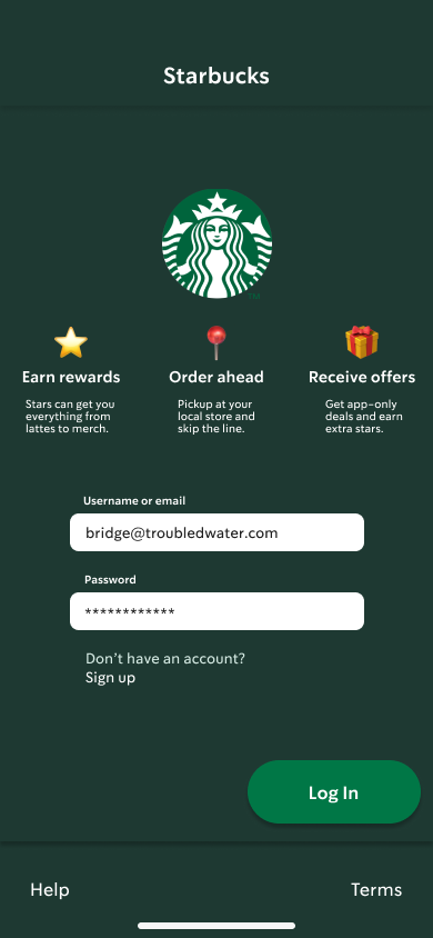
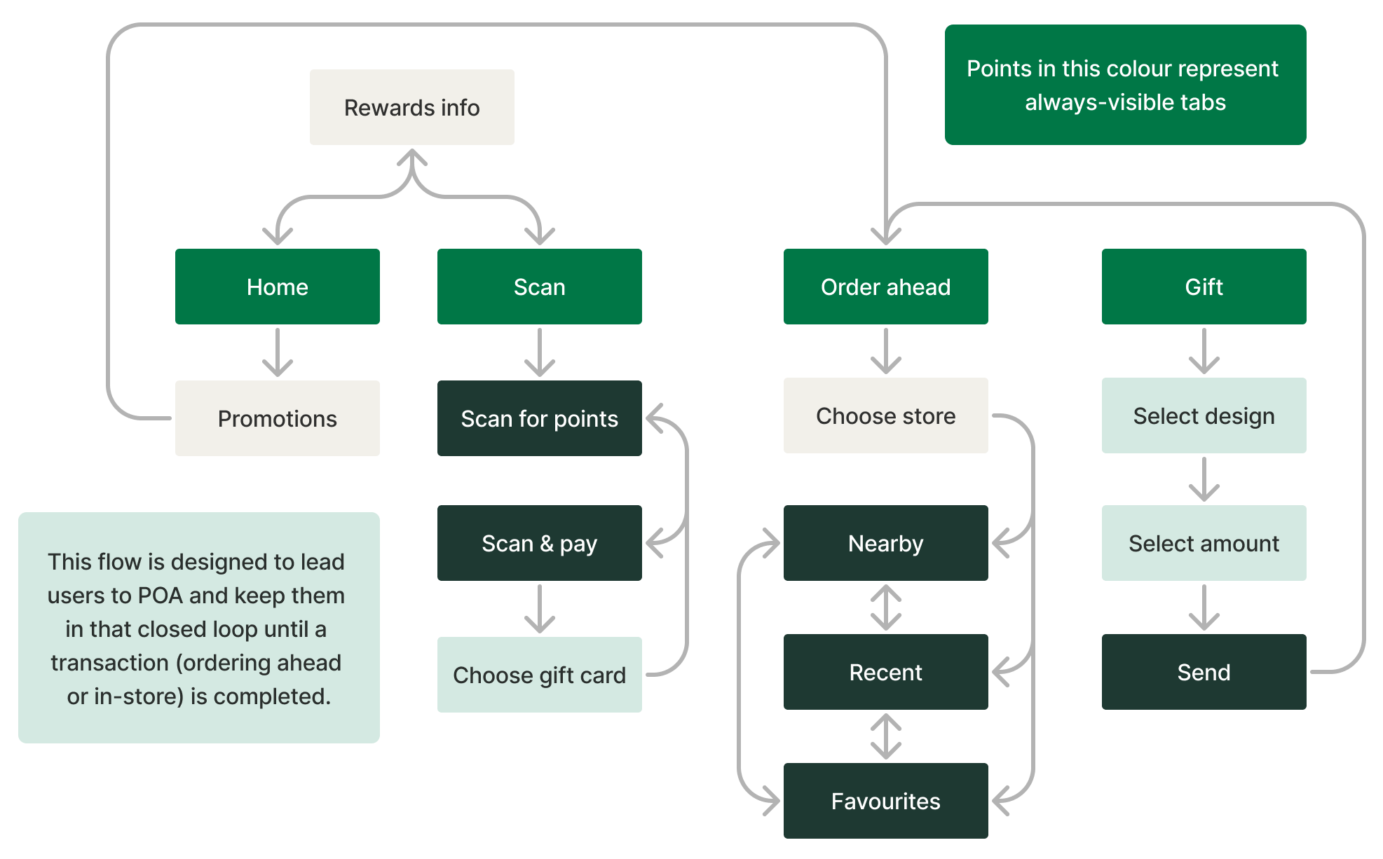
DELIVERABLE
My scope of research, adapted user journey, and modified style guide came together into the service prototype which you can test out for yourself, just below (if you’re on mobile, click here).